Thursday, November 19, 2009

Edward Hopper - Andy Warhol - Walker Evans - Robert Frank - Rachel Whiteread - Bruce Nauman

From a variety of disciplines (painting, silkscreening, photography, sculpture, video) these artists have
covered the subjects of domestic space, privacy, and Americana. Hopper's paintings portray the individual
in the American site. Warhol's pop imagery reflects aspects of Americana (as well as Hopper and Frank).
Evan's photographs document the American subject, in particular the home, in the context of the
Great Depression (certainly a relevant period of today's generations). Frank portrays American's in a
similar way to Hopper, but focusing on overall American society, not just the individual. Whiteread's sculptures
document space (in particular the negative space of an empty home). Nauman's video document what we don't normally
get to see, in a voyeuristic way.

We utilized the subjects of these artists (the home, privacy, and Americana), but also the aesthetics,
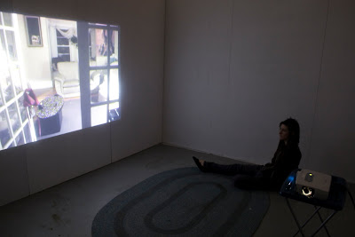
echoing Hopper, Frank, Evans, and Nauman. Our goal was to create a video which documented the privacy of the home,
with the subject of Americana (via sound clips from the evening news, recognizable items such as TV trays).


Bruce Nauman


Andy Warhol


Walker Evans


Rachel Whiteread


Edward Hopper

A Reaction

I think most people reacted the way Anita and I intended people to react : melancholy, a bit confused, and lonely. I have a personal background in photography and I tend to create images that are both sad and melancholy, so making a video was a method for translating photography into a more "sculptural" form. The biggest weakness of our project was the ambiguity. I believe a work of art shouldn't be too descriptive, to give the viewer some space to move, but we overstepped that a bit and ended up making the whole thing a bit vague (why are we sitting here?, why are we watching this looping video?, what do all of these images mean?). Having the ambiguous figure move around in two of the clips, and then a voice clip didn't integrate well into the video (although fortunately it's easier to delete then to add). I still have no consensus on the furniture set-up. Some people argued that it was unnecessary and distracting, I agree. Others said that the furniture provided some kind of living space comparable to the one in the video, I agree. I think the furniture would be successful if we were able to make it look more like a room than anything else. On the other hand, it could also be just as fine if the video took up the whole wall. Some other points brought up was the lack of continuity in the way the video was shot. While I agree, there's a practical reason for not framing the subjects all the same way, our the curves in the hallway and all prevent the camera from shooting at that angle so I had to compromise and shoot the clips from various angles so I could capture the room wholly. I also wish the camera quality was in a higher resolution. I think the video would be easier to watch, since there was a lot of film noise present due to the lack of light. I had also mentioned my idea of perhaps using a cinematic camera, and what effect that would create. Certainly there would be more of a self-imposed narrative (one aspect of this project that I really enjoy in particular, it allows it to be "hands on" in a way) because the video would produce a movie effect.

Adam

Sunday, November 15, 2009


Thursday, November 12, 2009

From the notebook

Originally I intended my sketches to be incorporated visually into the blog, but everything is interlaced with other notes and personal information making it all incoherent. I decided to pick out the aspects of my notes I though were relevant to our process.

Original ideas included such things as turning the MWC into a gallery of itself, highlighting all of the seams, the floor, the roof, ect. and the viewer would walk around like in a normal gallery setting.
Another idea was make the MWC inaccessible. Putting something, or doing something to the cube that the viewer wants to see, but is prevented from doing so.
The idea for our project then originated from another original idea in which we wanted to create a sort of "mind park" where people could relax, but also view art. Our idea was to put a project on the ceiling, and our job was to facilitate the comfort of the viewers so their minds could comfortable retreat into themselves. It came from the MoMA exhibition last winter, Pipilotti Rist: Pour Your Body Out (7354 Cubic Meters). People in the gallery were relaxing, taking naps, talking amongst themselves, not unlike a public park during the spring time. Public art also does the same thing, people congregate and use the art for their own leisure and relaxation.

This then led us to ambience. Rist's large looping video clips created an ambience in the room. Looking up at the ceiling kind of alludes to the mind, the upper domain of our existence.

So now we have our key ingredients: video, ambience and environment, and a form of inaccessibility (by using video, the viewer is only limited to what they see)

The final concept was created when I was sitting downstairs in my living room reading, and I really like the ambience of my house, it had a melancholy feel to it, just the type of thing I would want to photograph and document. Sometimes creative ideas come out of us like a baby demanding to be born, it just flows against our own will. Likewise, I can't really explain why or how we came up with our idea, it just kind of happened, but of course our original ideas influenced our though process. So we came up with this vivid plan to have 4 projects simultaneously looping, but only one sound would be played for one of the four projections. This would accomplish our ambience and environment goal.

Unfortunately we only had access to one projector, but probably that was a good miscalculation. I think having 4 videos looping at the same time would be psychedelic and a sensory overload. We ditched the idea of projecting the video onto a ceiling since there was no ceiling for the MWC, but also there would be no basis for displaying a video that way.

After shooting the videos, there needed to be a unifying element. How did all these disconnected clips relate to each other? One idea was to put a familiar object or image in every shot, something for the viewer to follow. One suggestion was a red thread that followed through every room, imagery like in William Kentridge's film (traces of past movements still present on the screen).

So we collected the video, the photography, and the sound. Now to rationlize what we had just done: we imported our site (our house) with the intention of capture the lonely melancholy mood. The house and its tenants were ambiguous, it could have been anyone. So we realized our project was more a commentary on an American household. Melancholy and sad definitely fits that description.

Thursday, November 5, 2009

Response to critique


Notes

Quiet
Architectural
References Rachel Whitereed
Specific to suburban NY life
Time Based
Too ambiguous
Uncertainty about speaking (sound issues)- What does it mean- something about a metaphor?
Narrative- desire to fill in with a story
Take out looking upstairs shot- not congruent with the rest of the shots
Depressing
Everyday
Voyeurism
The starkness of the cube

We sat down and talked about our critique and agreed that the work was a bit too ambiguous.
I think some of the scenes with Sam (mysterious leather coated man) talking confused our viewers and the view up the stairs wasn't congruent with the rest of the scenes. Adding more sounds from the television and more hourly church bells would better convey the passing of time.
By transporting domestic space into a gallery space we are not only commenting about public vs. private but the subtleties (i.e. light, sound, color, media, technology) that shape our everyday life. Hoping to achieve a sense of isolation we put 3 pieces of American furniture into the gallery that seem lonely and unwelcoming.

Sunday, October 25, 2009

House music

Considering outside sources of sound that permeate into a modern home

Ring of church bell every half hour
Television
Cellphones
Passing traffic
Wind blowing the door open
Door Bell

Thursday, October 22, 2009